
Flight.
Reimagined.
Designed around people. Built for the future. Flight, elevated.
Wisk Aero
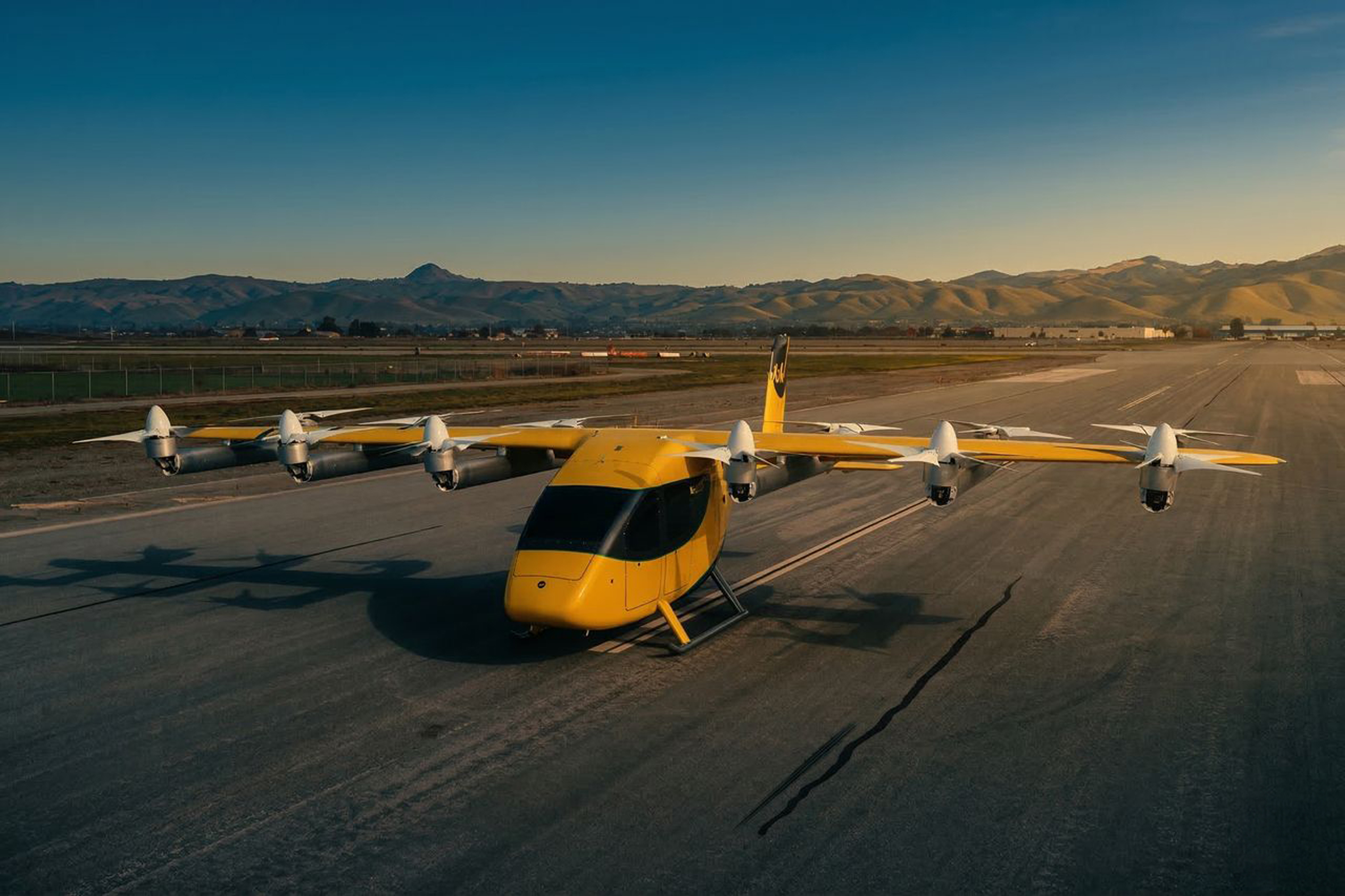
Wisk Aero, game-changers in emission-free autonomous air taxis, needed to take their brand to new heights. My goal was to refresh and evolve the brand, using and expanding on existing standards as creative guardrails.
Where others saw guardrails, I saw room to flex. I refreshed the logo, introduced a new brand shape, expanded the color palette, and carried it through UI design systems, presentation templates, the internal site, and swag, raising every touchpoint to a new standard.
I’ve had a massive impact on leading the evolution of the Wisk brand to even greater altitudes.
Envisioning a new era
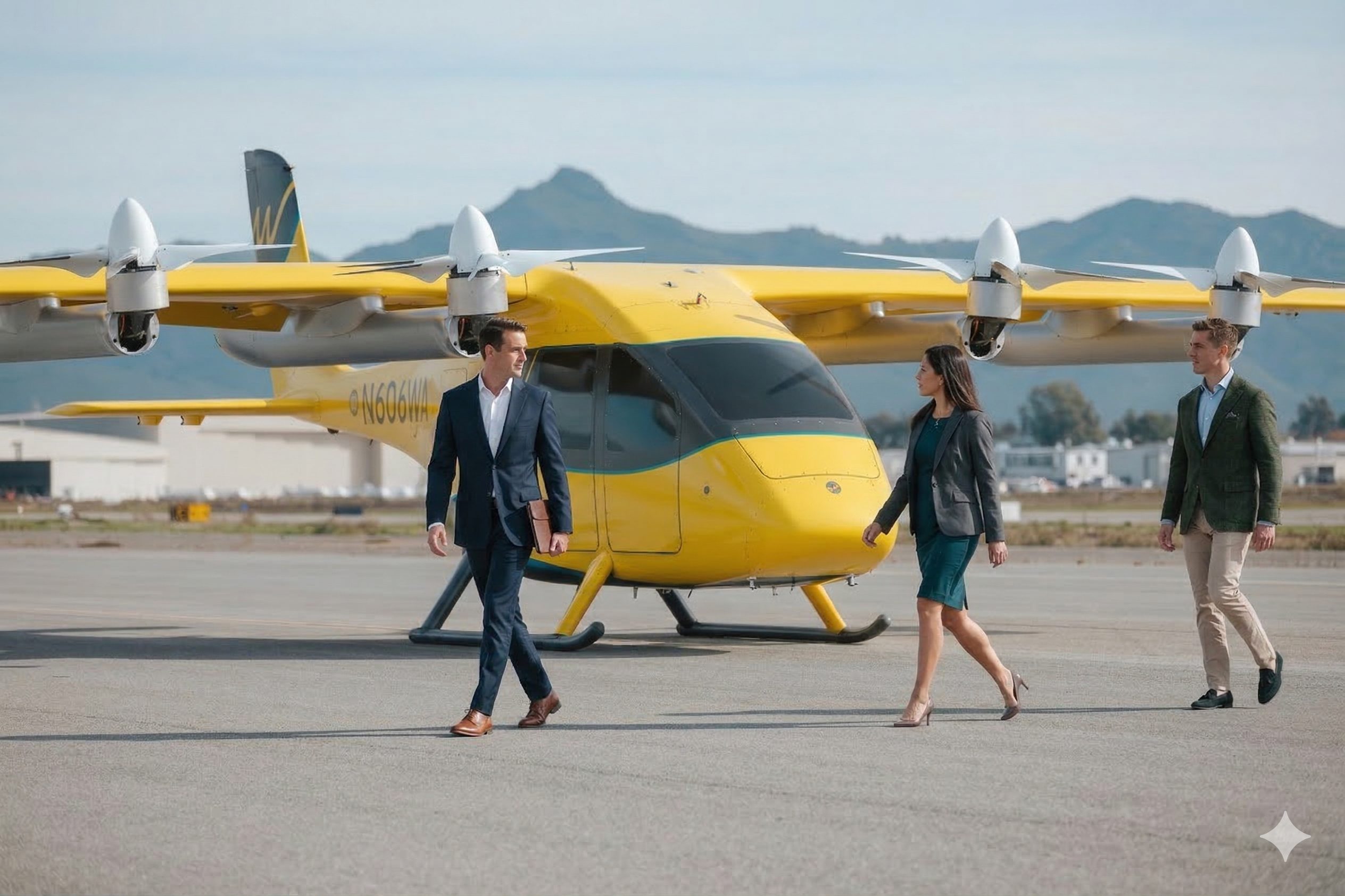
The rebrand was an opportunity to rethink the experience from the ground up. From the product itself to everything that surrounds it. As Wisk continues to build towards a future with autonomous flight, I brought the full ecosystem together across strategy, messaging, visual identity, digital, and more. The result is a brand built to make this new era of flight feel tangible, intuitive, and ready for what’s next.
01.Color System
Our colors are as bright as the future we’re building. Wisk Yellow leads the way. It’s the spark of joy you’ll see on our aircraft and in everything we make. Flight Blue brings in the calm of an open sky, and Gray and White keep things clear and grounded. An extended palette of deeper blues, softer tints, and Cool Lavender lets us adapt to screens, footage, and everyday moments, so Wisk always feels welcoming and recognizably ours.
02.Typography
Aero Sans balances aviation’s heritage with modern simplicity. Its shapes take cues from the golden age of flight: circular letterforms, aerodynamic curves and loopy descenders that add warmth and personality. Underneath, it’s built for clarity and accessibility, with a full range of weights that let one typeface perform equally well in bold headlines and quiet body copy.
ABCDEFGHIJKLMNOPQ
RSTUVWXYZ
abcdefghijklmnopqrstuv
wxyz!
"#$%&'()*+,-./:;<=>?
0123456789
Typeface name - Regular (placeholder specimen)
Safer
skies
every
day
Traffic Level: Zero
Traffic Level: Zero
Traffic Level: Zero
Traffic Level: Zero
Traffic Level: Zero
Traffic Level: Zero
Research & Development
Simply Fly
All-Electric Flight
The Future is Vertical
03.Brand Activation
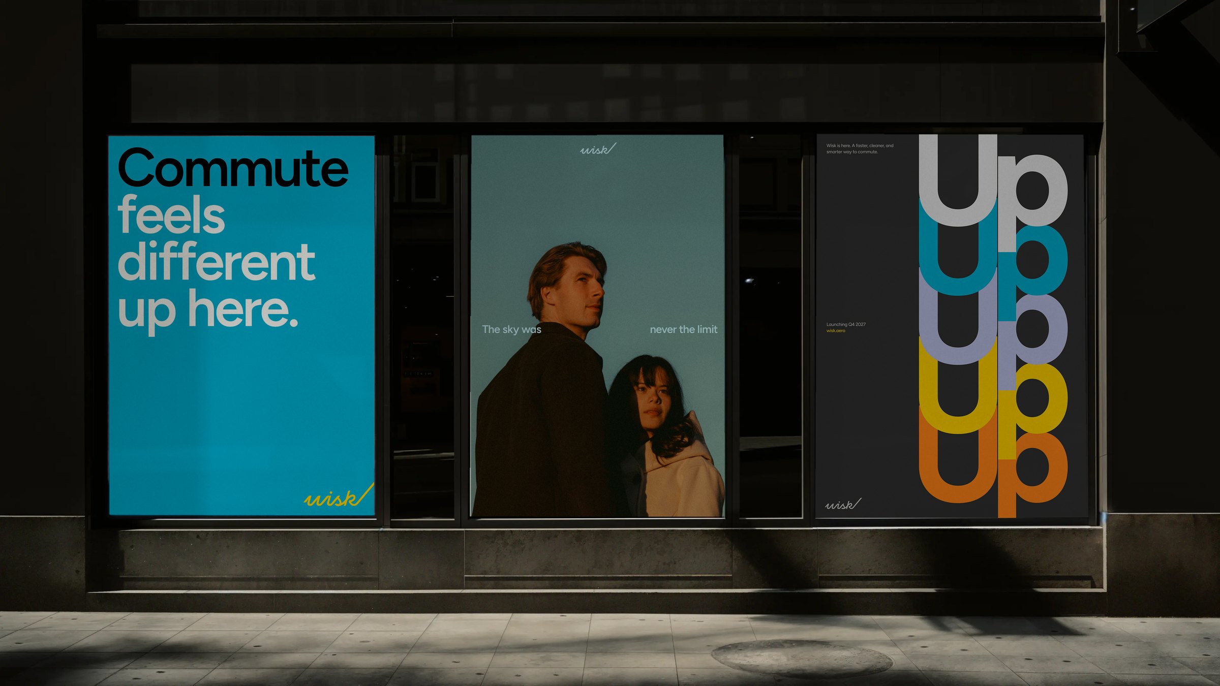
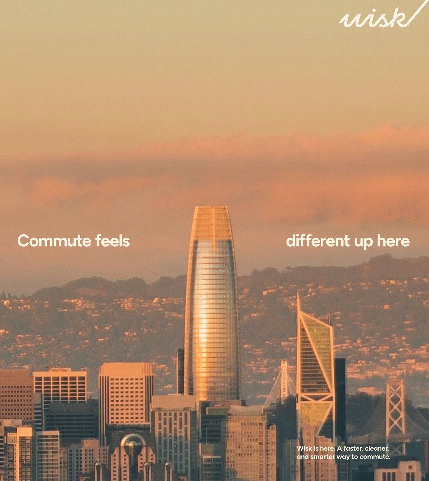
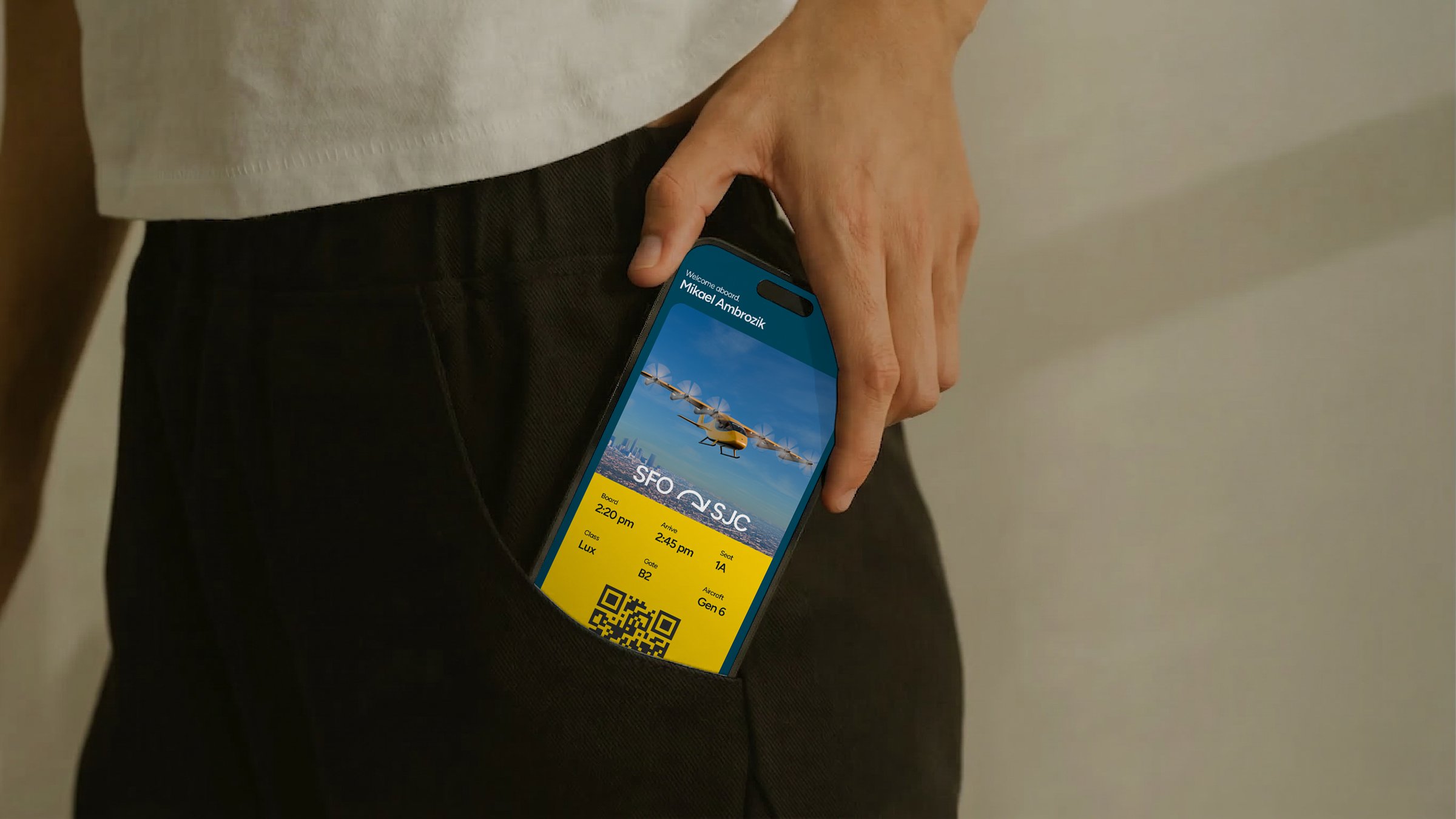
Safe, everyday flight for everyone starts with how it looks and feels. Across apps, wearables, environments and events, the system turns an ambitious vision into real, welcoming moments that people can connect with.

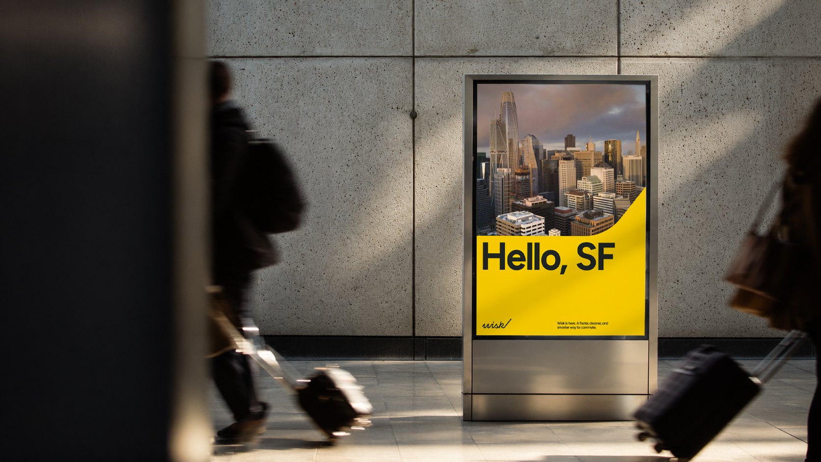
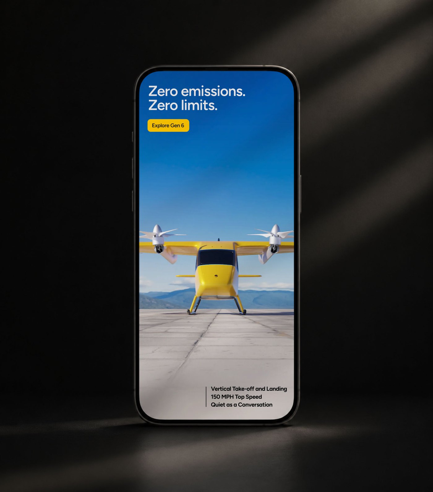
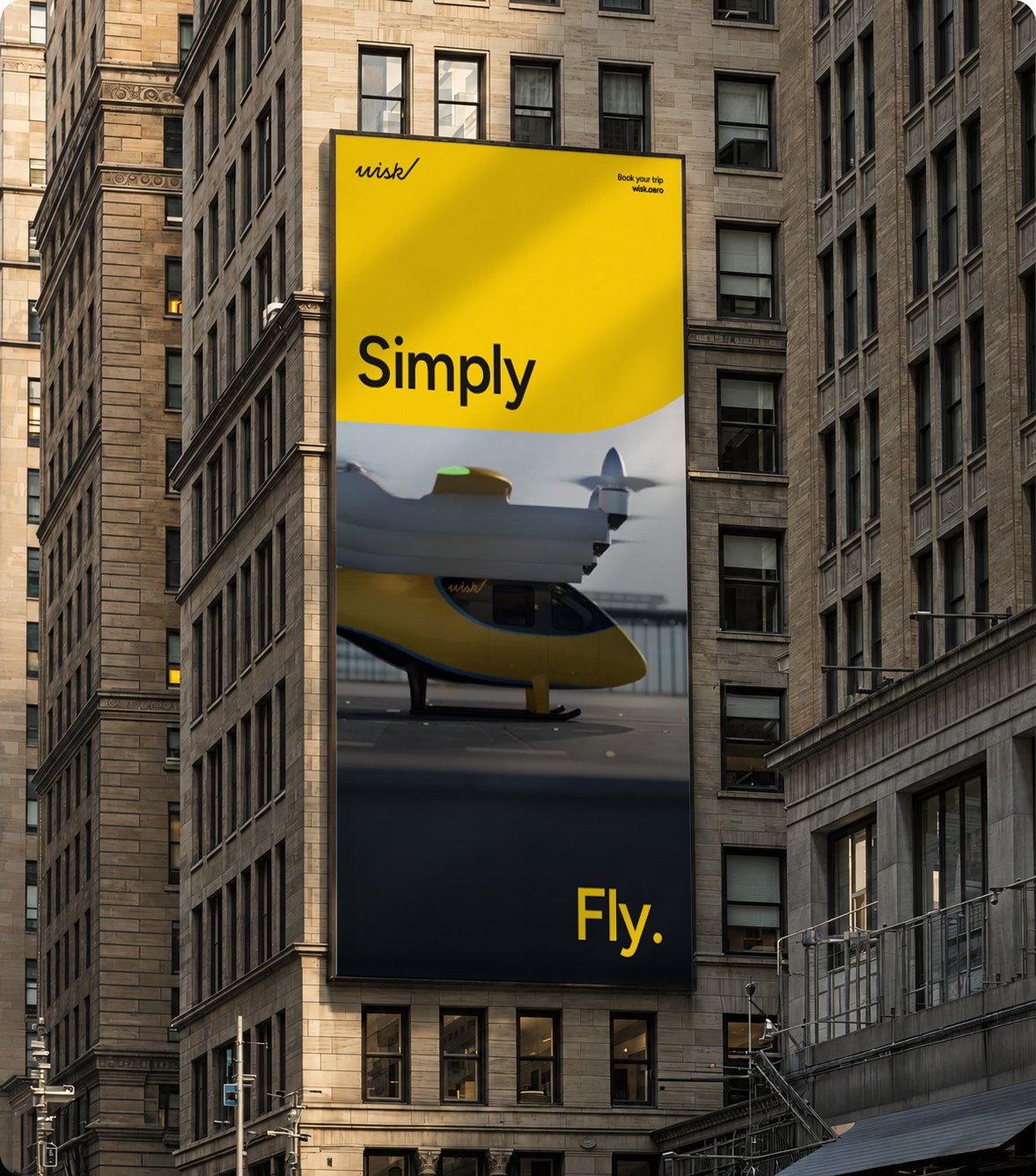
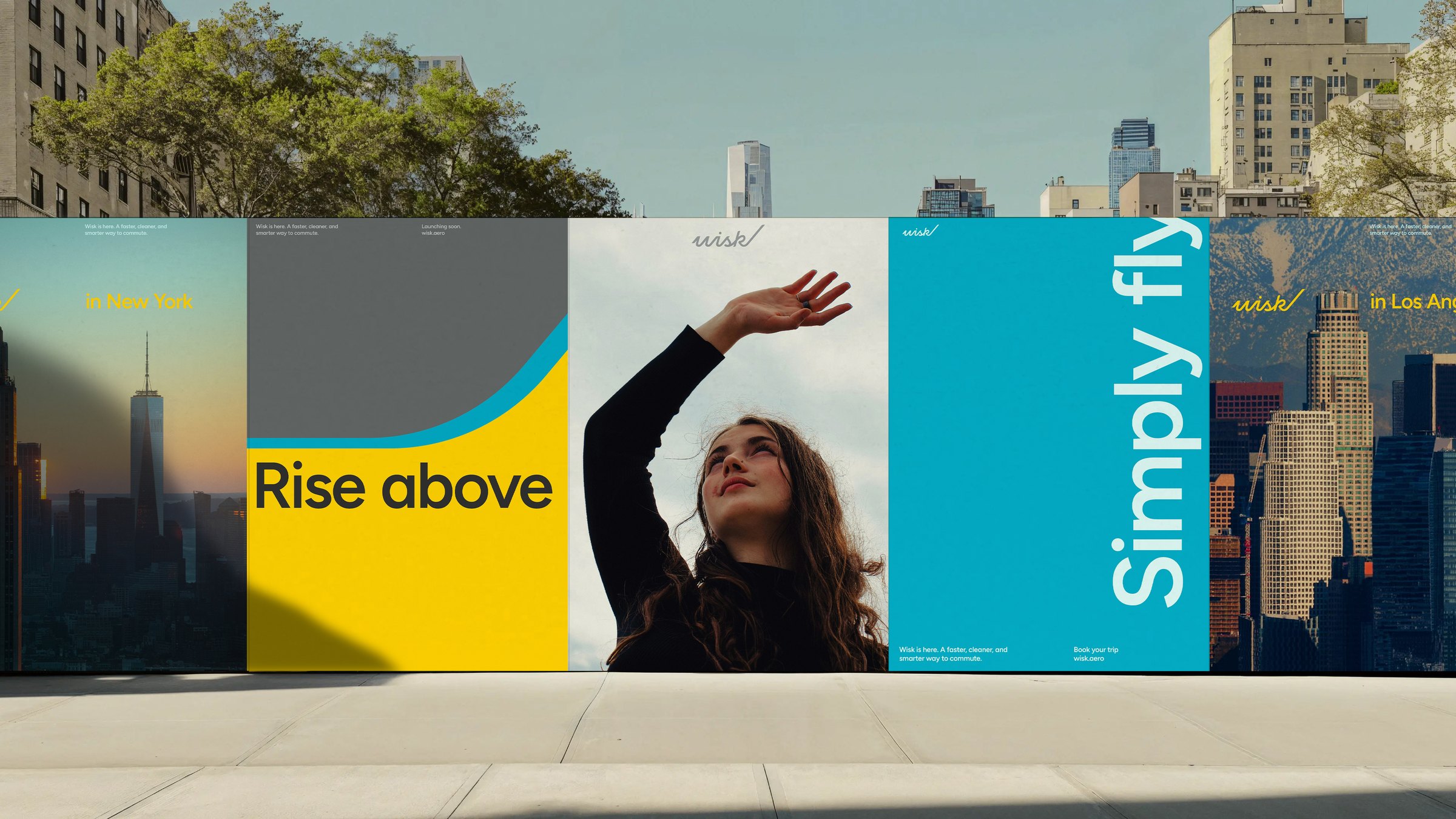
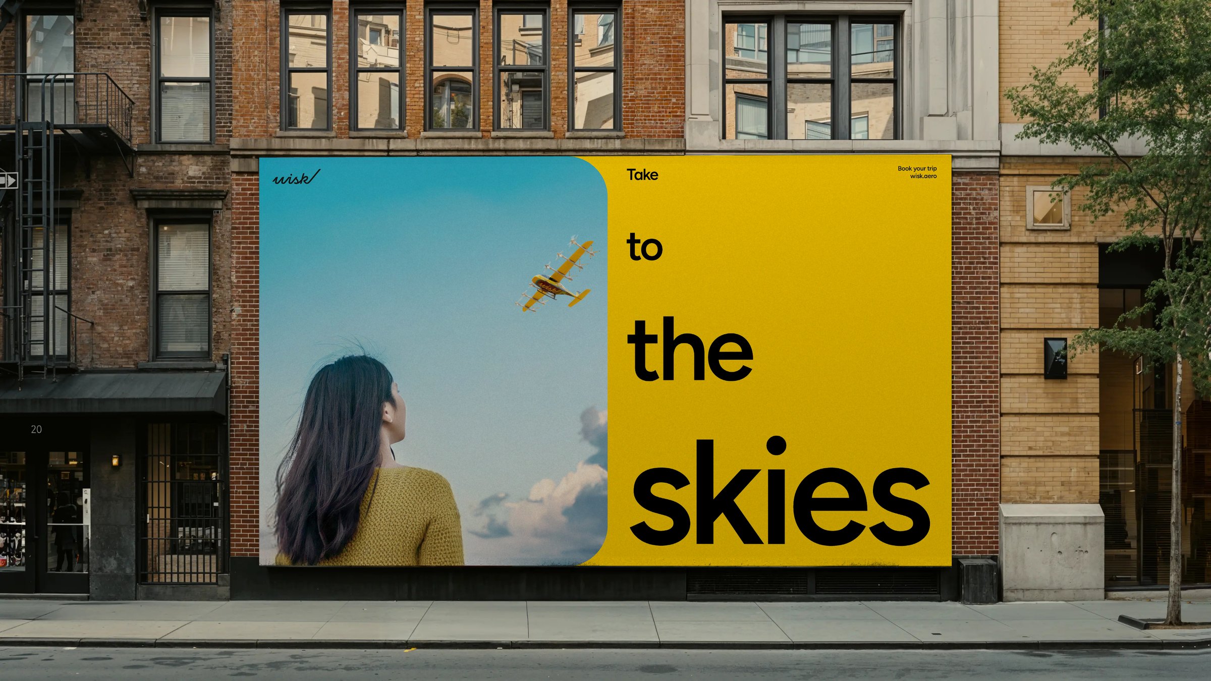

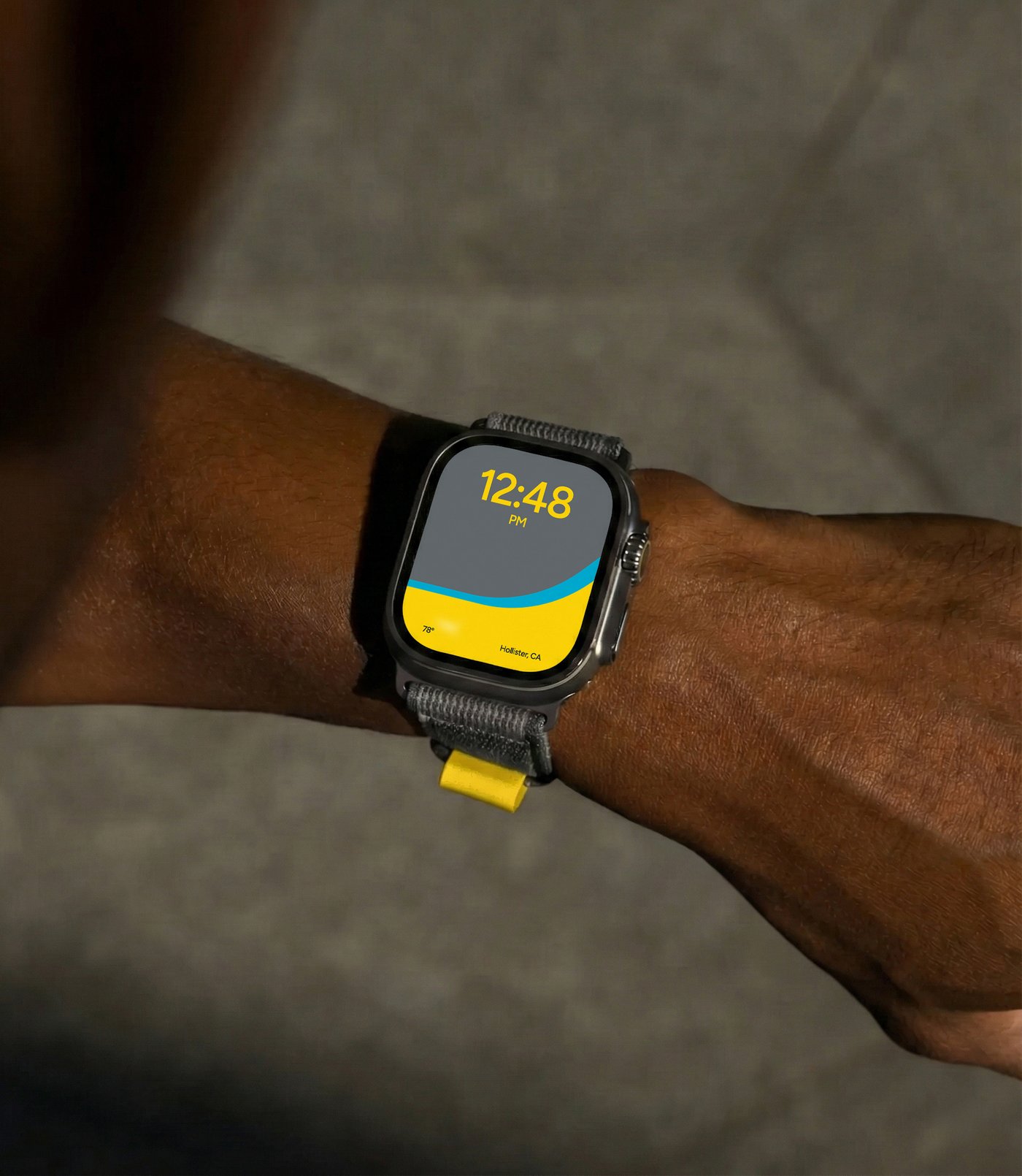
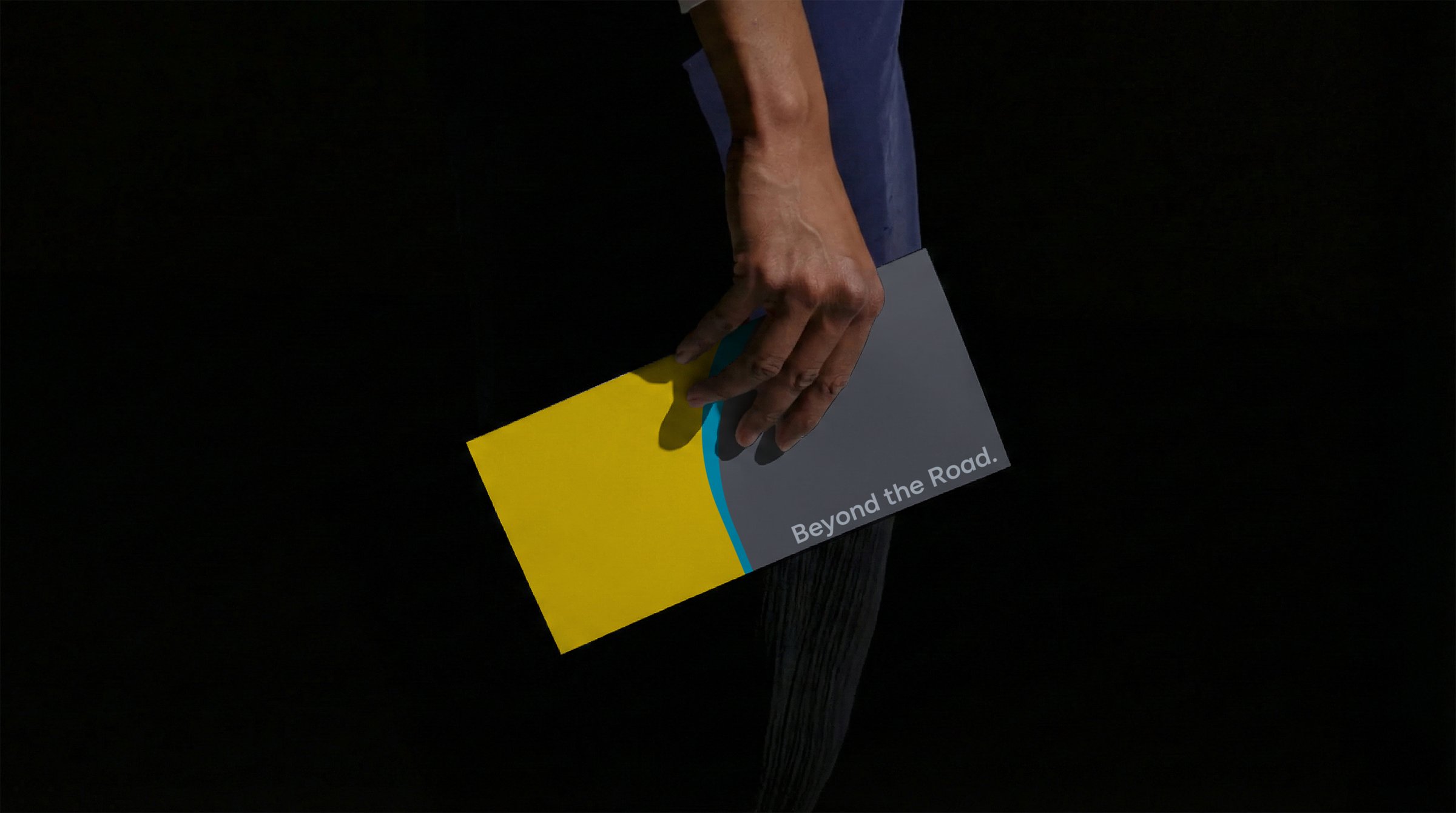
Positioning. Strategy. Visual Identity. Logo Design. Brand Choreography. Brand Architecture. Art Direction. Motion Design. Website Design. Development. App Design. Uniforms. Swag. Brand Partnerships. Social Media. Illustration. Custom Typography. Aircraft Livery. Product Renders. World Building. Photography. Aircraft Schematics. Signage and Wayfinding. Campaigns. Activations. Events. Architecture (Buildings).
Project Tools